EON Longevity Tea

In 2021, we teamed up with Fine Hygienic Holding for an exciting project. Our task was to bring something unique to the world of wellness branding and drink packaging design. It was more than a project for us – it was about telling an extraordinary story of how EON Longevity Tea came into being. We wanted to infuse a sense of wellness and fresh thinking into every part of it. And push the boundaries in wellness drink packaging design, aiming to blend a healthy lifestyle narrative with innovative design that can grow with the product range as it expands globally.

Year

2021

Client

Fine Hygienic Holding

Drink Packaging design and branding of a premium wellness tea known to deliver an array of benefits, and is professionally certified by the Medical Wellness Association.

Our client came to us with a story for the books and we were thrilled to translate this story into their package design and brand guidelines in compliance with the US and International market standards and regulations.
Eon Founder and Fine Hygienic Holding President of Wellness Elia G. Nuqul, and Fine Hygienic Holding CEO James Michael Lafferty, stumbled upon a viral video of a centenarian man in the Mediterranean who attributed his health to a mix of herbs he drank each day. In search of the recipe, Nuqul embarked on a journey that eventually led him to a small village where he found the energetic 108-year-old. Nuqul spent time with the unique elder to learn about his ancient family blend of herbs that grew naturally on the mountainside.

The eon team moved on to participate in what became one of the largest-ever clinical studies in the supplement space which resulted in unexpected outcomes. Years on, the journey culminated in eon Longevity +Plus, an all-natural beverage that has been clinically proven to provide several benefits.

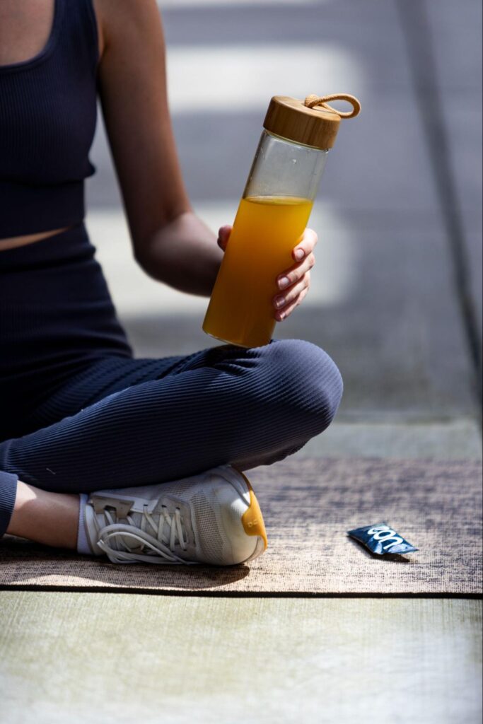
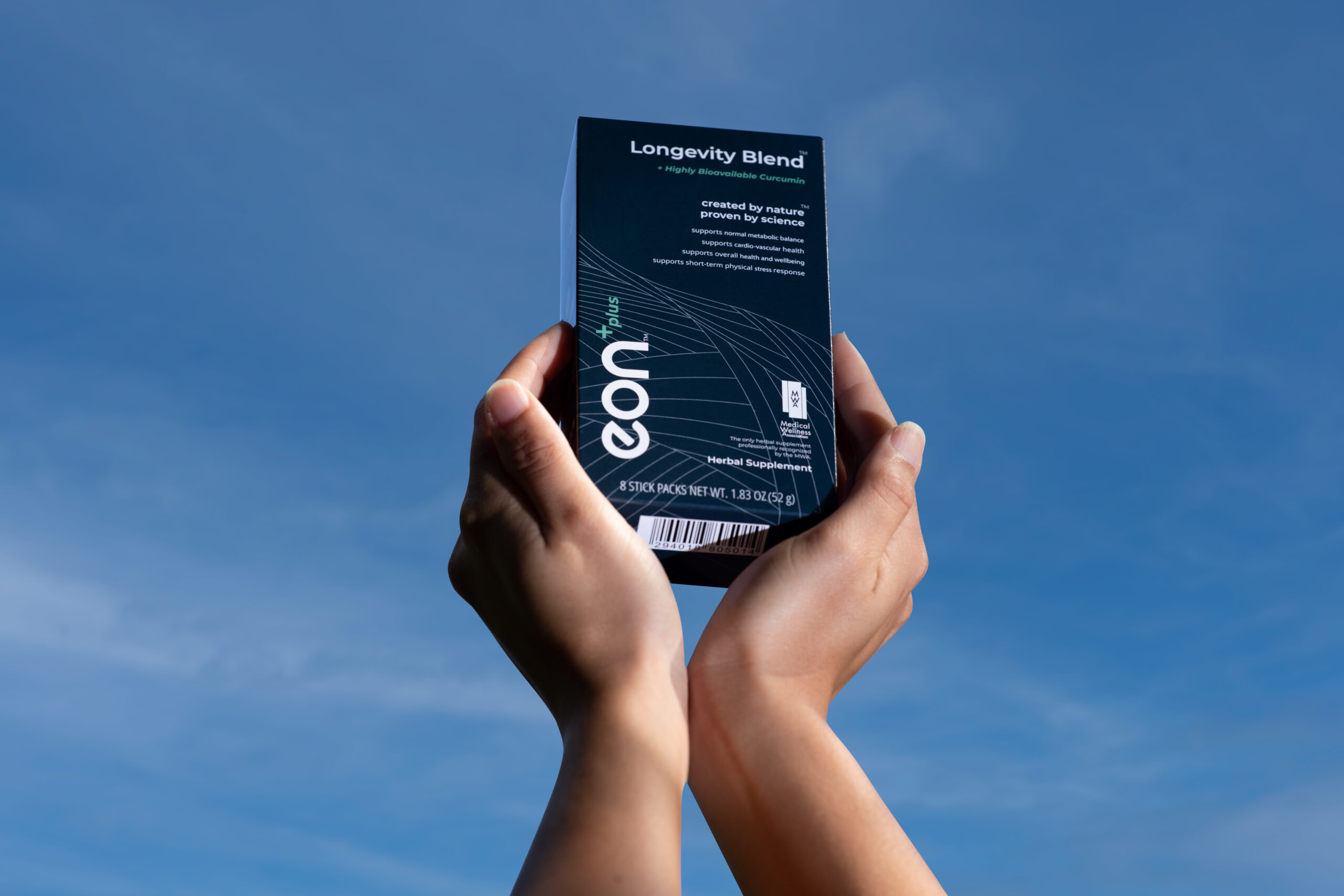
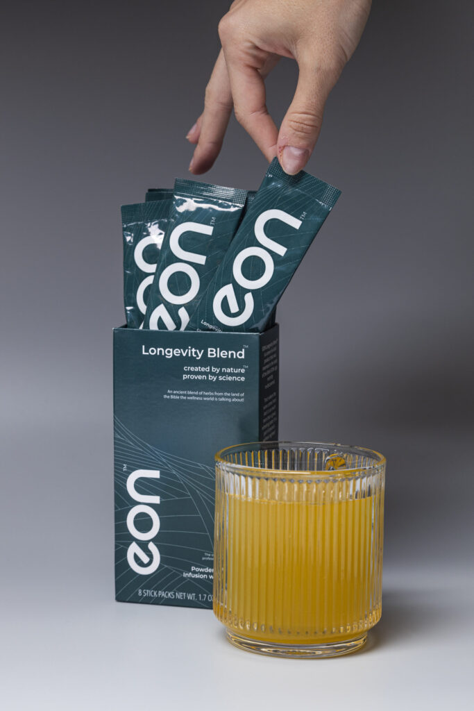
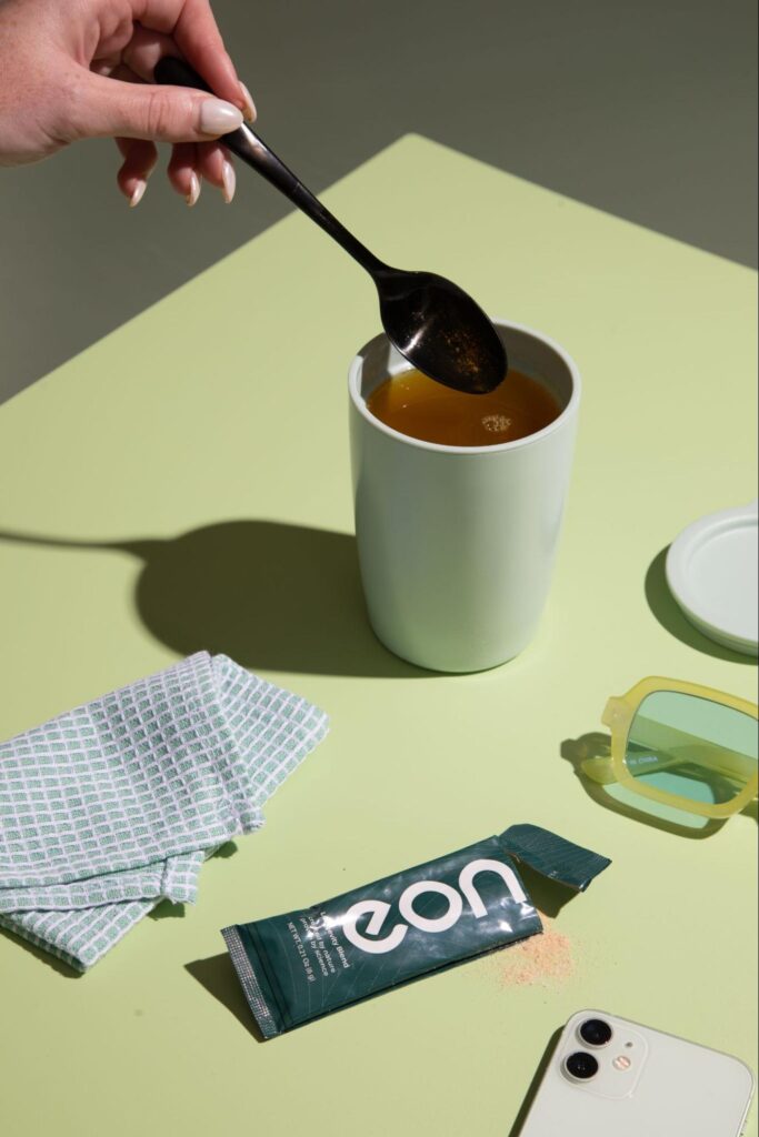
We developed a brand personality for eon that is humble, approachable, intelligent, informed and fit. This was reflected in our choice of color combinations, logo placement, layout, typography and styling. Prioritizing the benefits over taste, the brand exudes a fast-paced, on-the-go appeal, while maintaining an approachable, modern, minimalistic, gender-neutral, and premium essence.
Copy of EON 081623 2Y1A5592 scaled Twelve Degrees EON Longevity Tea
image10 Twelve Degrees EON Longevity Tea
image2 Twelve Degrees EON Longevity Tea

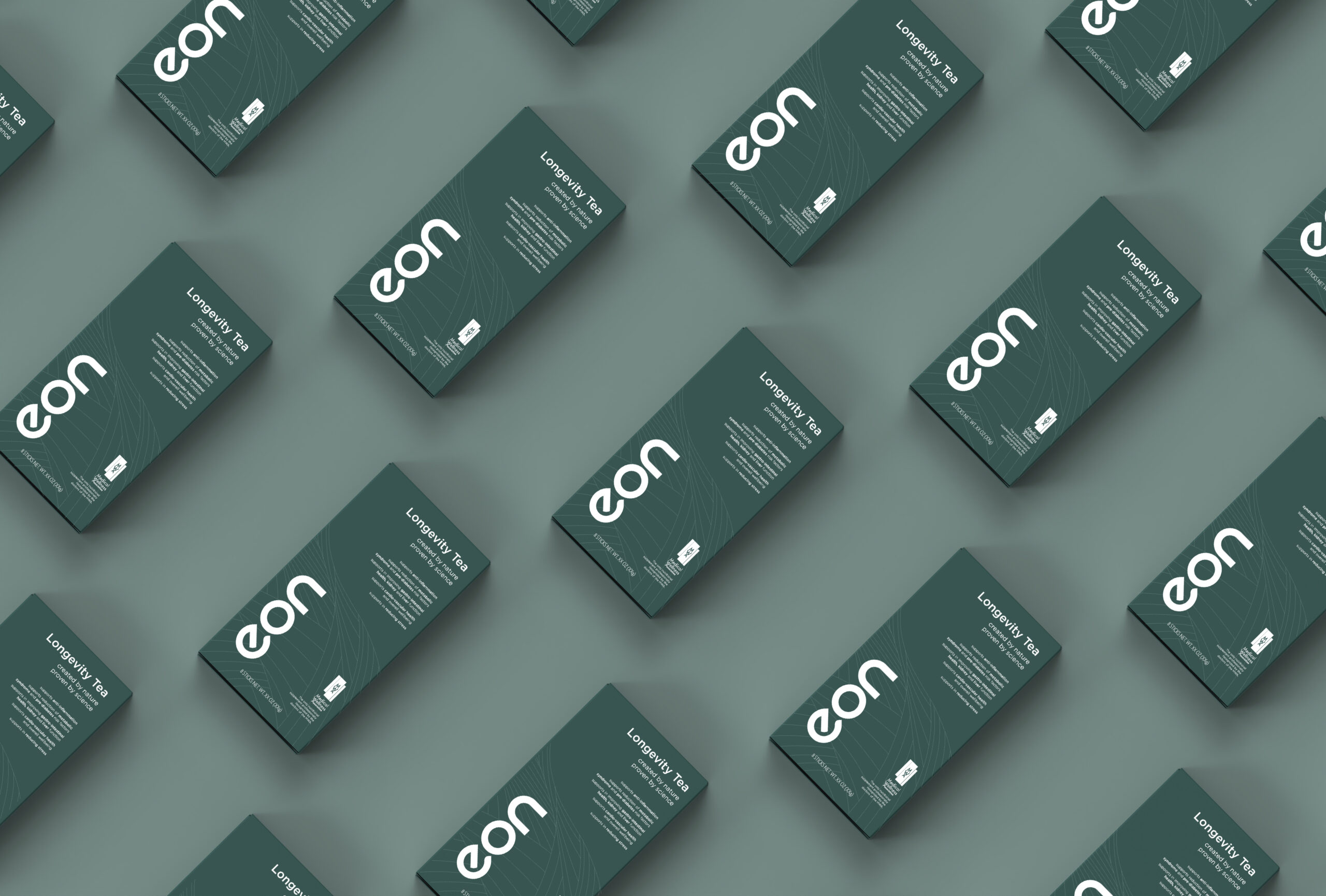
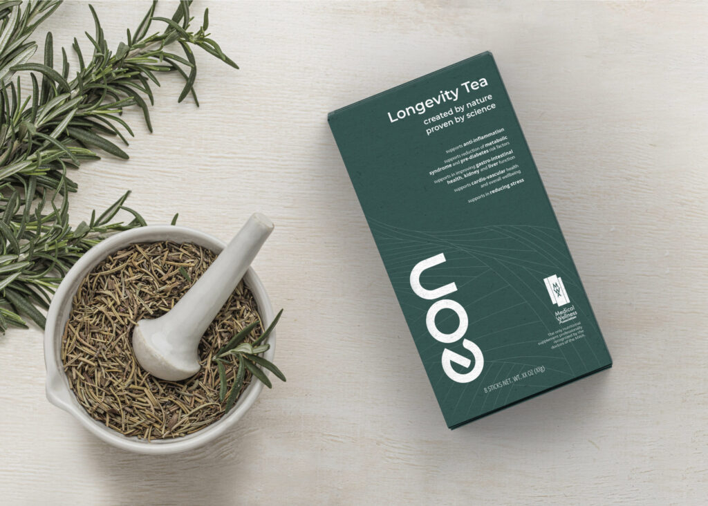
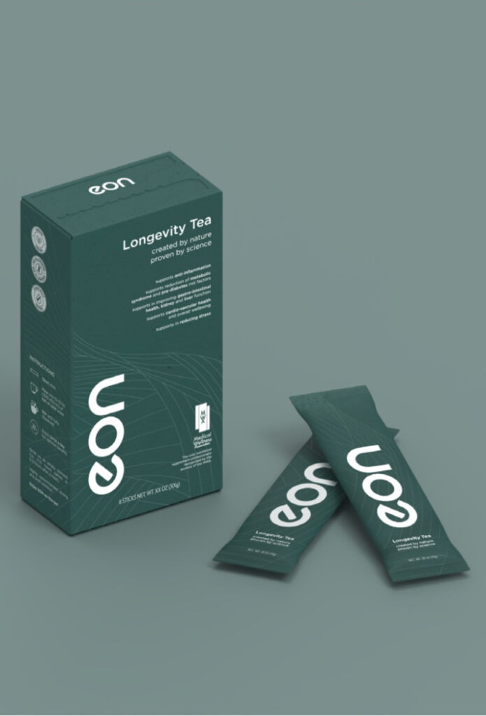
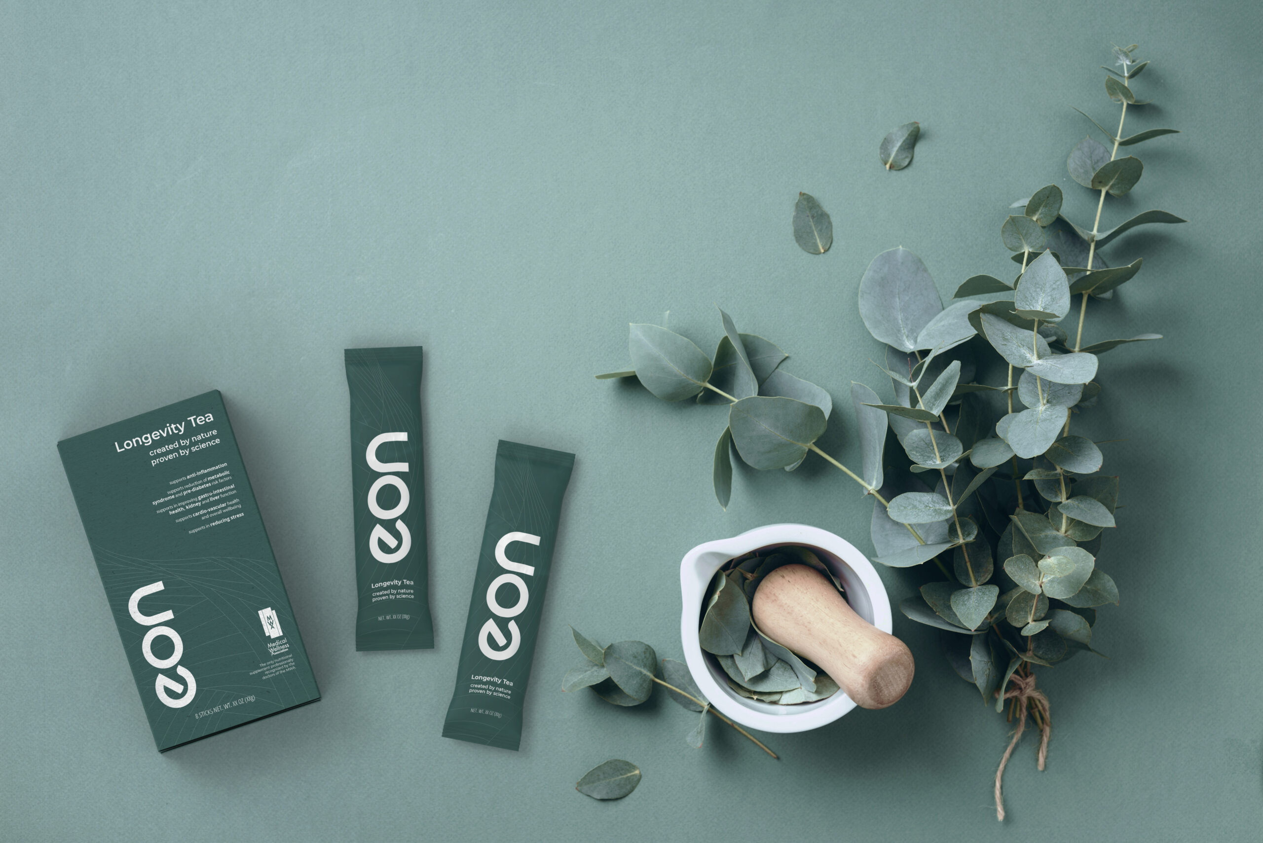
The imagery we created is inspired by our client’s story of discovering the herbs blend on the mountainside. We created an illustration that is a minimal and abstract depiction of a tea field mountain and a macro leaf structure. In the packaging, the lines are designed to draw eyes toward the logo and benefits.

EON Render flat green scaled Twelve Degrees EON Longevity Tea
Suggested for main page 6 scaled Twelve Degrees EON Longevity Tea
Rectangle 2 13 Twelve Degrees EON Longevity Tea

As for typography, we used fonts part of the geometric typeface family that are minimal, modern and engaging. The simple nature of the typeface we used communicates honesty, approachability, forward thinking mentality and brand purpose.

Top view in context scaled Twelve Degrees EON Longevity Tea

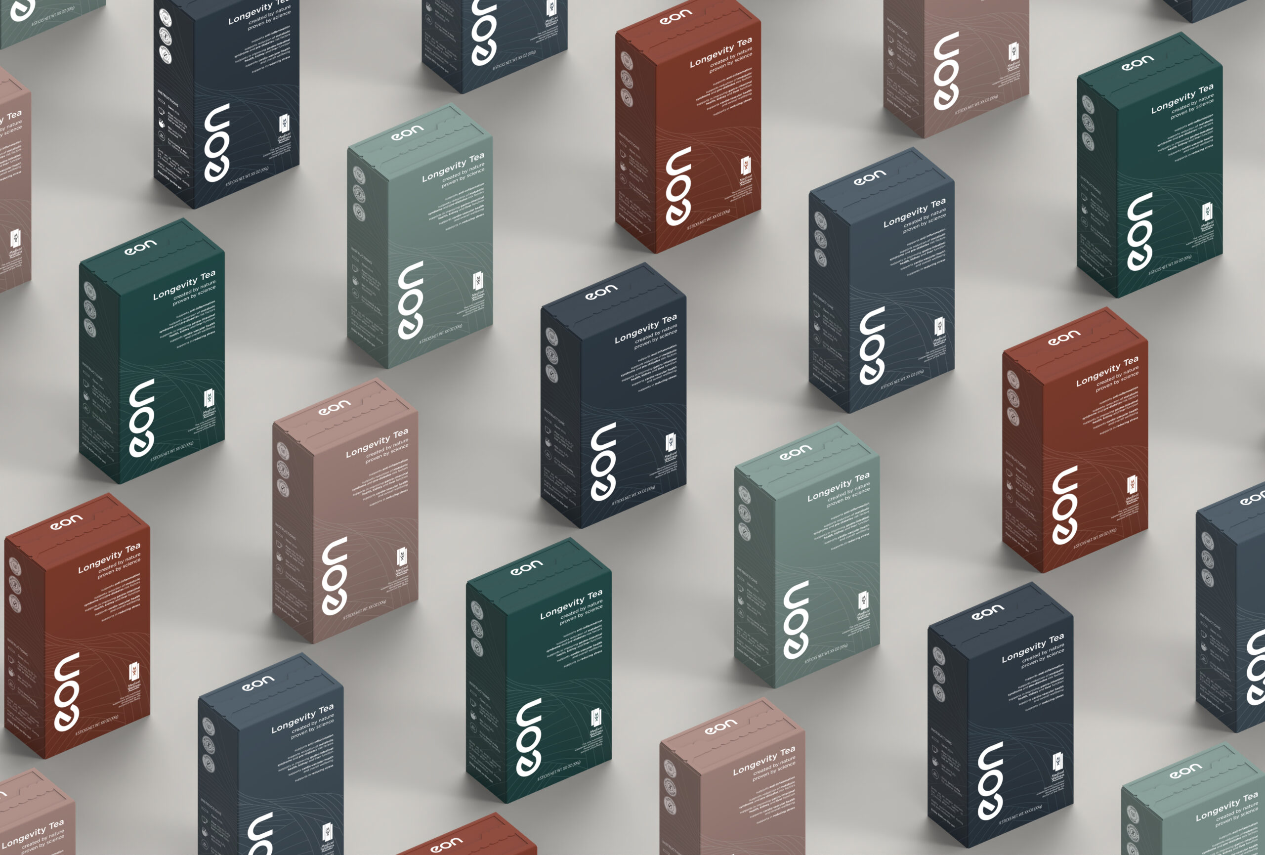
We created a color palette that is reminiscent of nature and a forest landscape thus depicting the mountainsides of the Mediterranean. The palette we created not only conveys the branding and message of eon, but is also inclusive in a sense that it is color blind safe.

EON Renders 02 Isometric with Logo scaled Twelve Degrees EON Longevity Tea

The strong efficacy of eon is reflected with a large logo that engages the customers. Our choice of capitalization was all deliberate as we associated capitalization with concepts of compassion, innovation, and power.

Stationery mockup1 scaled Twelve Degrees EON Longevity Tea

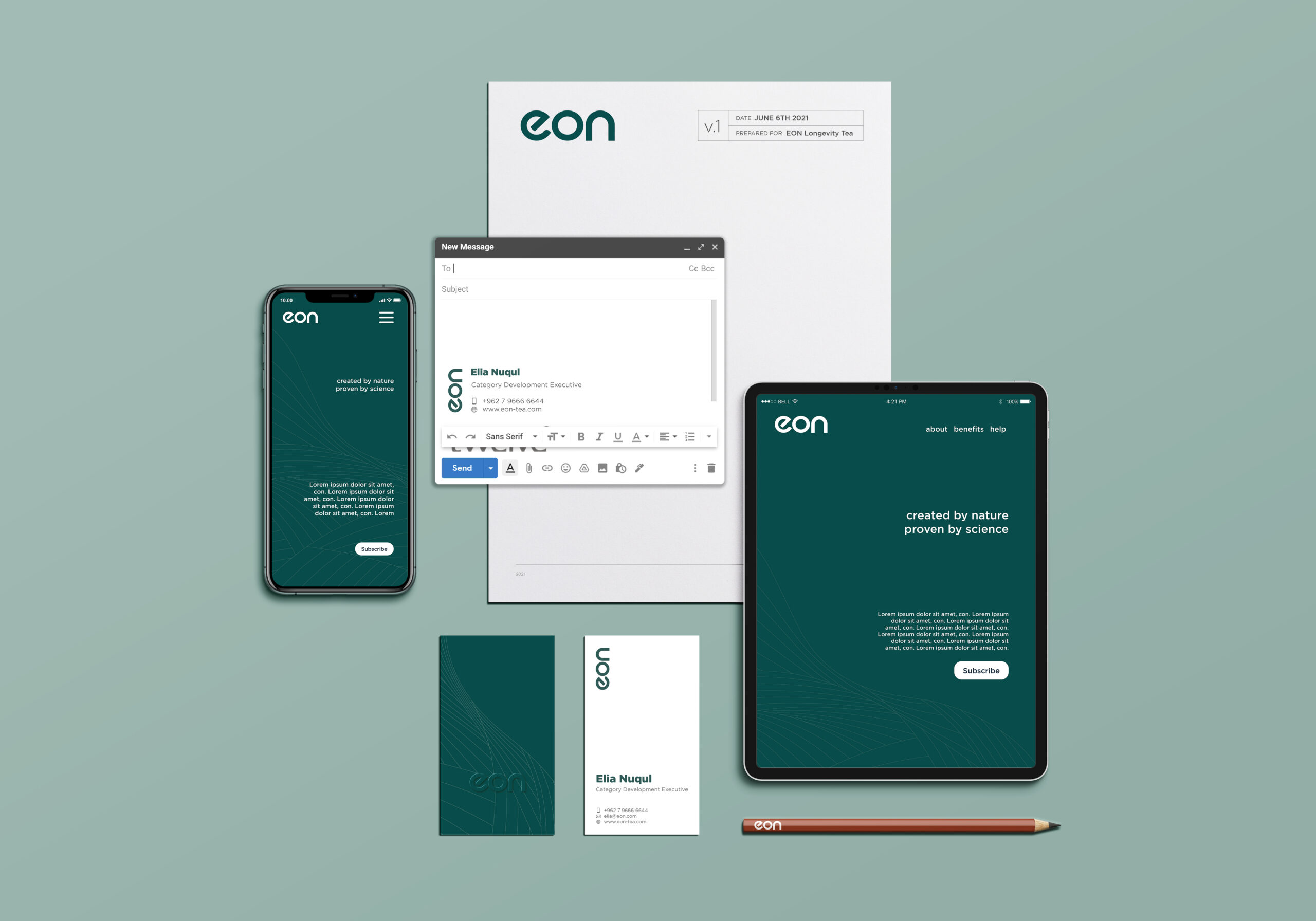
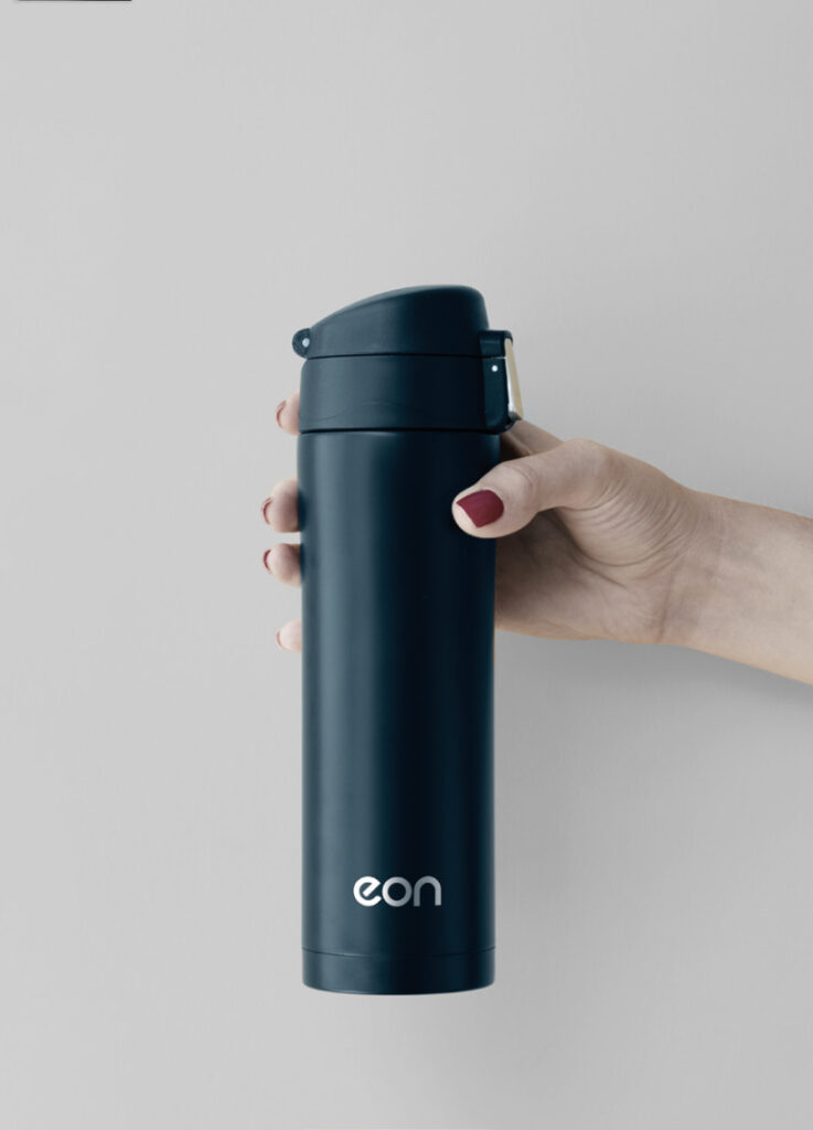
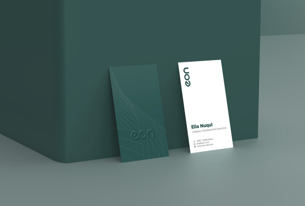
We also provided eon with ways to implement the brand guidelines we provided digitally, in print and even merchandise to maintain a harmonious and strong image.

Rectangle 4 4 Twelve Degrees EON Longevity Tea
Business cards render scaled Twelve Degrees EON Longevity Tea