Gader Al-Badiya
Arabic Food Packaging Design
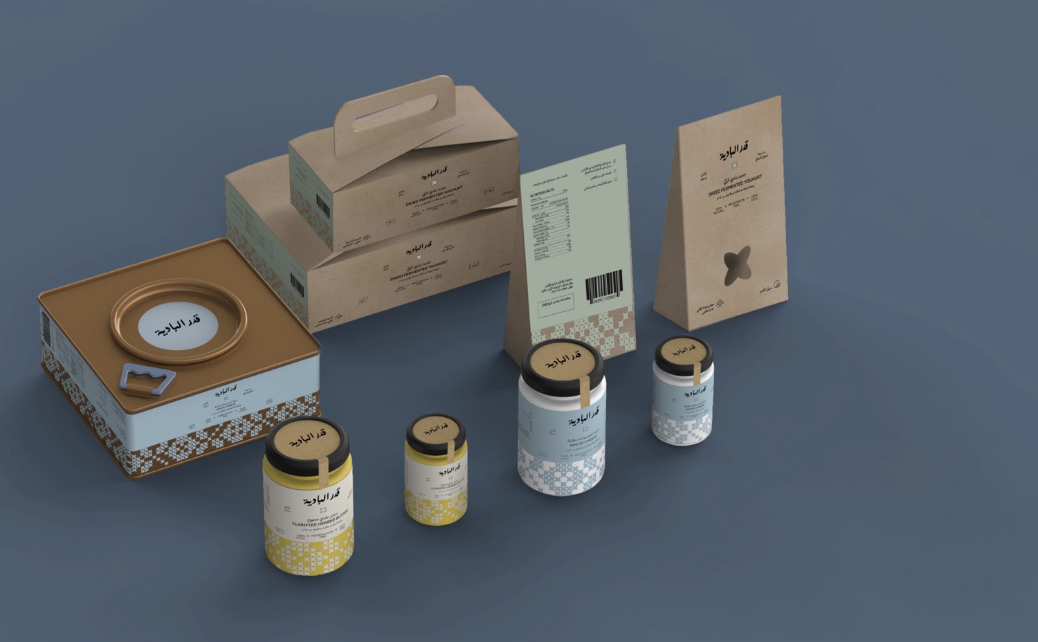
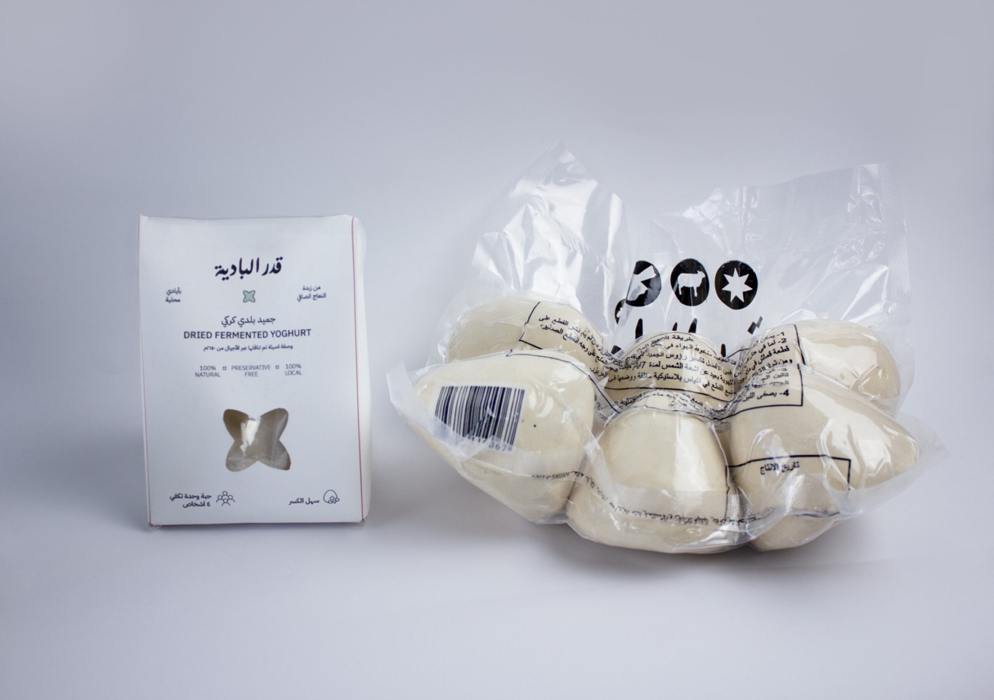
We embarked on a remarkable journey with Gader Al Badiya, diving into the world of food packaging design. Our goal was to transform and rejuvenate the brand visuals and packaging design of this esteemed Jordanian brand. We aimed to honor its rich array of local dairy products while infusing a modern twist. This project was a perfect blend of traditional Jordanian heritage and contemporary innovation in food packaging design, setting a new benchmark for creativity and cultural reverence in the industry.
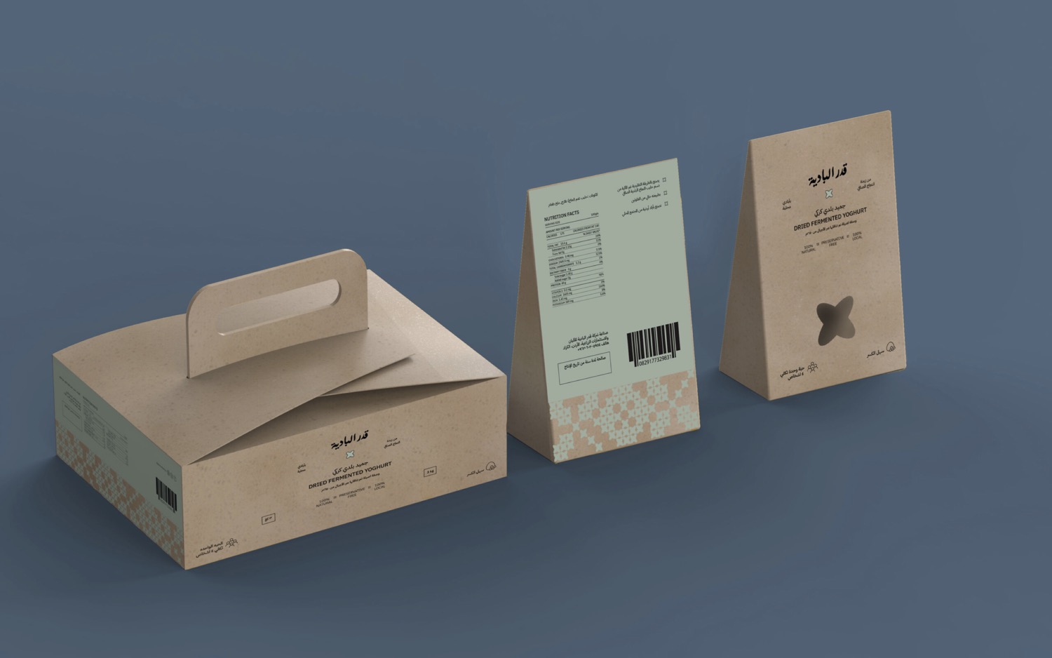
Karak, a governorate in south of Jordan, is famous for its “Karaki Jameed,” a dried yogurt made by salting a drying ewe milk. The Gader Al-Badiya project, established in 2018, was started by partners who recognized the need for a branded jameed in the market.
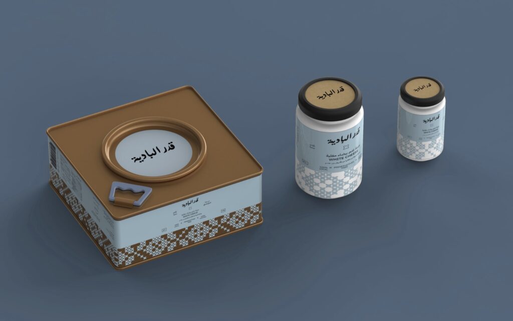
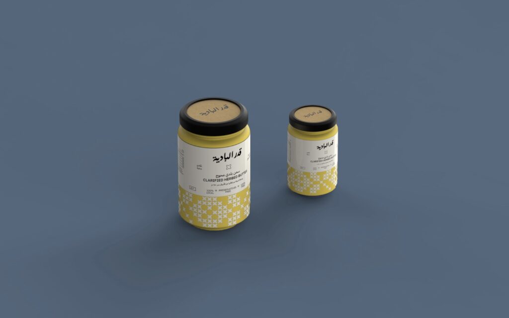
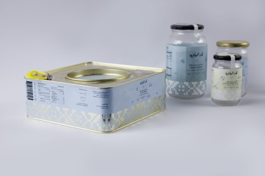
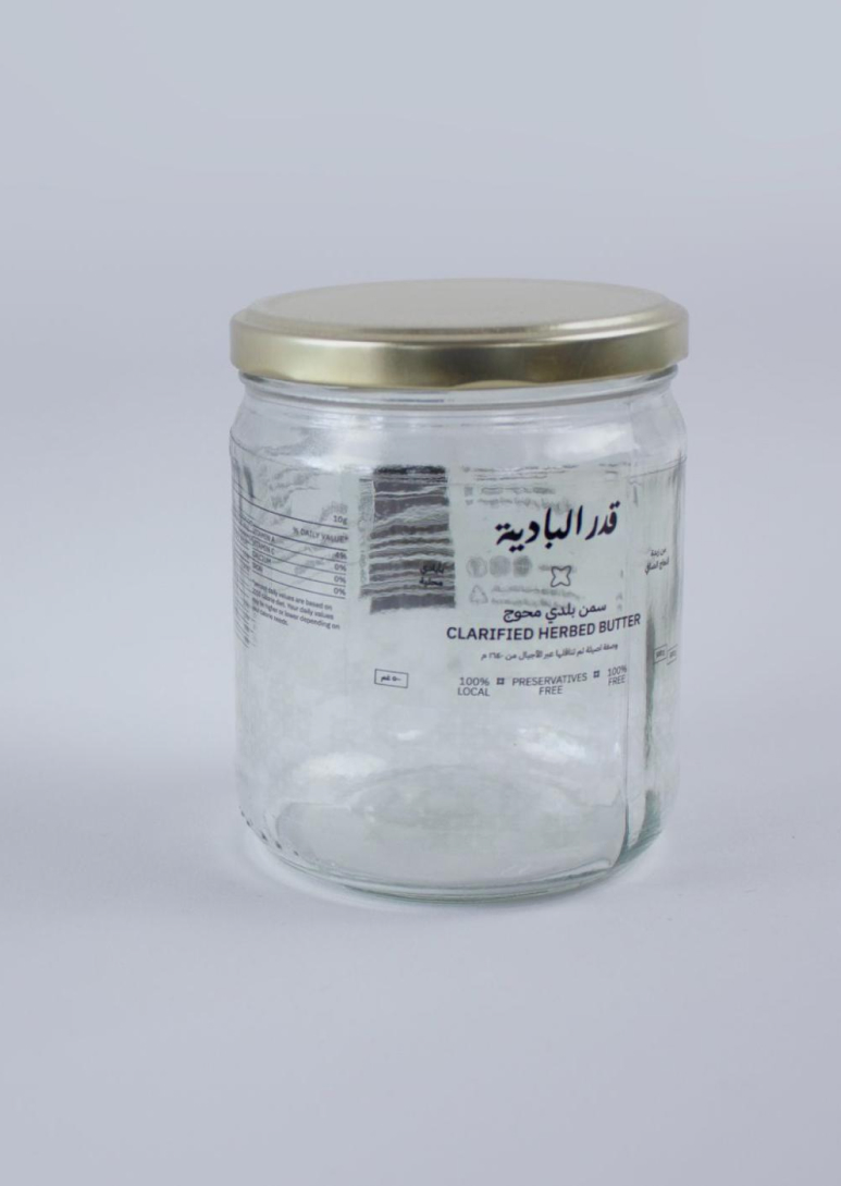
Gader Al-Badiya produces more than just jameed; the project also makes locally crafted ghee and white cheese. However, the main challenge faced was creating a distinct source for Karak’s renowned jameed. Nonetheless, the project remains steadfast in its commitment to preserving national heritage by promoting locally made goods and involving the community in the production and marketing of these products.
We conducted a comprehensive qualitative user research phase, allowing us to gain invaluable insights into user behavior and emerging trends. These insights were synthesized into a persona and a well-defined value proposition statement. This strategic approach has enabled the brand to foster meaningful connections with the ever-evolving new generation of shoppers while maintaining a harmonious relationship with more traditional customers.
To align with the project’s narrative, we crafted the packaging for Gader Al-Badiya to reflect its brand goals, resulting in the creation of purposeful brand patterns, color schemes, and messaging.
The brand emerged as a beacon of hope, supporting local production. We wanted to create a design that showcased how deeply Gader Al – Badiya are rooted in the region. They source their raw materials from local producers, strengthening bonds within the community while empowering local women through employment opportunities.
We used a cross-stitched Kerak print in a bold manner. The composition of the pattern highlights the product visibility and adds a contemporary touch to the traditional look of the embroidery. We also selected a font for the Body Text that embodies neutrality, featuring a Grotesque style known for its excellent legibility across print, web, and mobile interfaces.
Year
2021Client
Gader Al Badiya- Gader Majali
